Rocky Mountain Sunsets

During the chinook of the last few days there were several beautiful sunsets that I took time to enjoy. Looking west at the Rockies is one of my favourite skylines and their silhouette at dusk often adds immensely to a landscape photograph.


The chinook ended last night with the arrival of a snowstorm which continues this morning. I’m not too dismayed, it was nice to have a break of warm weather in the middle of winter.

Sharing this post is welcomed - but please do not use individual images without permission from Christopher Martin in advance.

Metallic Moose?

It could be a Canadian rock band but here I am talking about a duotone process for creating black and white images of a moose I photographed yesterday.

Lately I have been experimenting with using the split toning controls to replace my black and white conversion workflow. The slightly metallic look appeals to me and I like the dimensionality that I can create using this technique. I have applied this technique to people and landscapes and wanted to try it on a wildlife subject. This moose looked great among the warm fall colors so it was fun to take that starting point and try to create a different feel to the images.
The specific process I follow starts in Adobe Lightroom’s Develop module but is applicable to Photoshop or any other editing program where you can set the colors. First I zero out the import settings so that I am starting with the unaltered RAW file and then I build the image following these are the steps to create this look.
Split Tone Color:
I like to set my highlight color to a shade between gold and silver (in LR I adjust the hue and saturation to get the tone I like). For the shadows, I set the color to some shade between blue and grey.
Tone Curve:
I apply an S curve and then tweak it to find the balance of shadow and highlight that works for me on that image.
Basic Adjustments:
Next, I adjust the Blacks, Fill, Clarity and Exposure to find the final look that I am looking for.
Detail Adjustments:
To finish I, like many, apply any noise reduction and sharpening that I feel adds to the image. I don’t use either very much but here with the fine detail in the moose’s coat, I found raising the sharpening amount and detail added to my enjoyment of the images.
Usually I have a pretty good idea of what I want the image to look like with this technique but a change to the tone colors or the mix of settings can make a surprising change to the feel of the image.

Sharing this post is welcomed - but please do not use individual images without permission from Christopher Martin in advance.

Split Toning Images in Adobe Lightroom
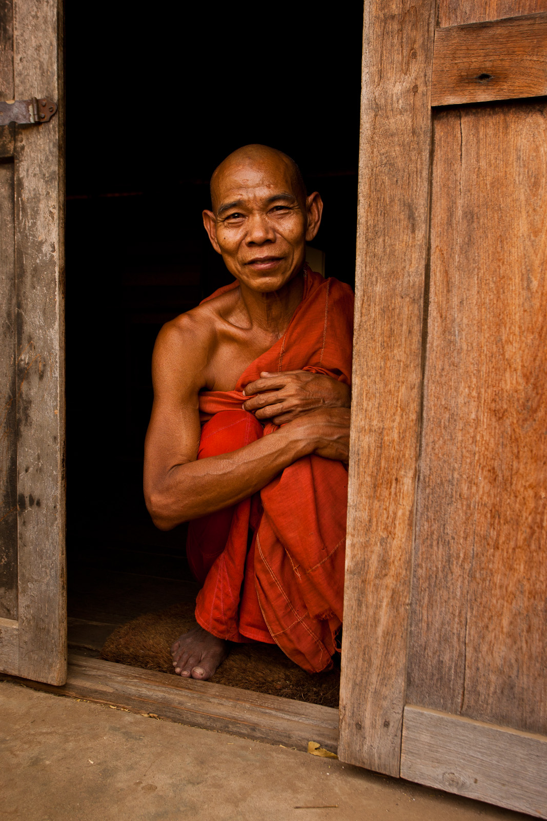
With this photograph, I used the split toning controls within Adobe Lightroom’s Develop Panel to make a different looking image. I converted the image to black and white then used the split toning section to set the colours that I wanted to use to tone the image (a grey-blue for the shadows and a grey-gold for the highlights). Using the sliders to tweak the hue and saturation of these tones, I was able to bring a subtle, metallic sheen to this monk’s skin. I had this look in mind recently which has a very different feel from the original, colour image which has warm earthy tones.

Here is a more typical look that I like in my black and white work

In the original, the dust in air has warmed the light and given a glow to everything.

I like how you can use great light to create different versions of the same image. I’m still not sure which one I prefer. Colour is pretty consistently a main theme in my images but I like the glow and the slightly metallic look in the split toned edition.
