The view from my chair

I was in Birmingham Alabama a couple of years ago for a ceramics technology seminar and got out for an evening of street shooting. I had supper at this diner and the view from my table was interesting and raised a few questions that stuck with me.
I processed this image in Adobe’s Lightroom and Topaz Adjust to create a vignette around the edges of the frame. The color treatment was to work with the garish fluorescent lighting in the restaurant and create the mood that I felt in the scene.
Sharing this post is welcomed - but please do not use individual images without permission from Christopher Martin in advance.

Bel Air Wreck on the Prairie

This beaten down shell is on a salt pan in the middle of a barren stretch of prairie near Gull Lake, Saskatchewan. The country roads that connect all parts of the Canadian prairie hold many long forgotten photographic treasures like this car, farmsteads and weathered buildings. I love finding these great locations and try to re-visit them whenever I can. I have visited this car and a neighboring broken down farm several times over the past five years.

With a little down time so far this holiday, I have been working with some different software to test them out. Here, I’m using Topaz Adjust 4 to process the photos for a saturated, over the top look. The software integrates seamlessly into Adobe’s Lightroom (my main developing and cataloging software) and is reasonably priced at $50. I am usually less garish in my post processing but it is nice to try some different looks.

In these images I have started with the Topaz Spicify preset as a starting point, then adjusted some of the levels to my taste within each picture and then re-imported into Lightroom to adjust some of the color channels and the edge smoothness.
Sharing this post is welcomed - but please do not use individual images without permission from Christopher Martin in advance.

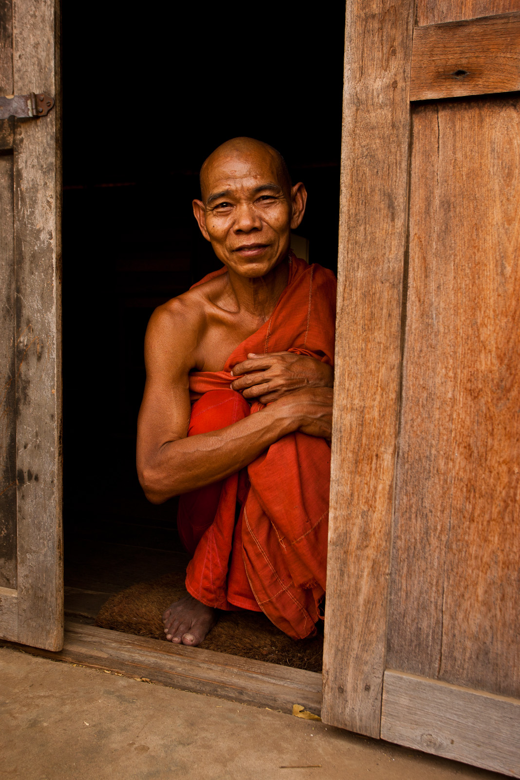
Split Toning Images in Adobe Lightroom
With this photograph, I used the split toning controls within Adobe Lightroom’s Develop Panel to make a different looking image. I converted the image to black and white then used the split toning section to set the colours that I wanted to use to tone the image (a grey-blue for the shadows and a grey-gold for the highlights). Using the sliders to tweak the hue and saturation of these tones, I was able to bring a subtle, metallic sheen to this monk’s skin. I had this look in mind recently which has a very different feel from the original, colour image which has warm earthy tones.

Here is a more typical look that I like in my black and white work

In the original, the dust in air has warmed the light and given a glow to everything.

I like how you can use great light to create different versions of the same image. I’m still not sure which one I prefer. Colour is pretty consistently a main theme in my images but I like the glow and the slightly metallic look in the split toned edition.
Sharing this post is welcomed - but please do not use individual images without permission from Christopher Martin in advance.

A Vivid Adjustment Technique with Adobe’s Lightroom
I tend to only display photographs that are relatively close to the way that I saw them when I was in the moment, making the image. I enjoy images of all kinds, be it HDR, Orton Effects, duotones, composites, etc. It just seems that of the work I do, I prefer the “realistic” look for the images I display. Behind closed doors, I spend all kinds of time processing some of my images with the previously mentioned techniques and others. A lot never see the light of day but now and then I like the results of this play.

In the photograph above, I manipulated the final look in Adobe’s Lightroom program. Working in the Develop module, I pulled the recovery, fill light, vibrance, contrast and clarity sliders all the way to the right (100) and black to 40. This resulted in a really garish look and the trick was to use saturation to reduce the color to suit your taste. I then tweaked all of the above sliders and the white balance to match what was in my head.
Give it a try if you are looking for another way to look at one of your images, it might work for you. This treatment works well on buildings and machinery, particularly when they are weathered. The effect on people is a bit of a wild card so it definitely doesn’t work for everything (or anything depending on what you like!)

For reference, above is the original photo with only an increase to contrast from the original RAW file out of the camera. I like this image and it has the look that I usually display. I’m actually pretty evenly split between these two versions of the photograph. The vivid one brings the temple more prominently into the scene and makes the story about the people and the temple. The “normal” version has the father and son as the primary subjects and the story is about the two of them together in the canoe. The temple serves as a great backdrop but does not demand attention. I would love to hear your thoughts on which works for you.
Just to highlight the impact of this treatment on buildings, here is another normal and vivid comparison. The photograph is also from Inle Lake.

Above is the normal version and below is its vivid counterpart.

